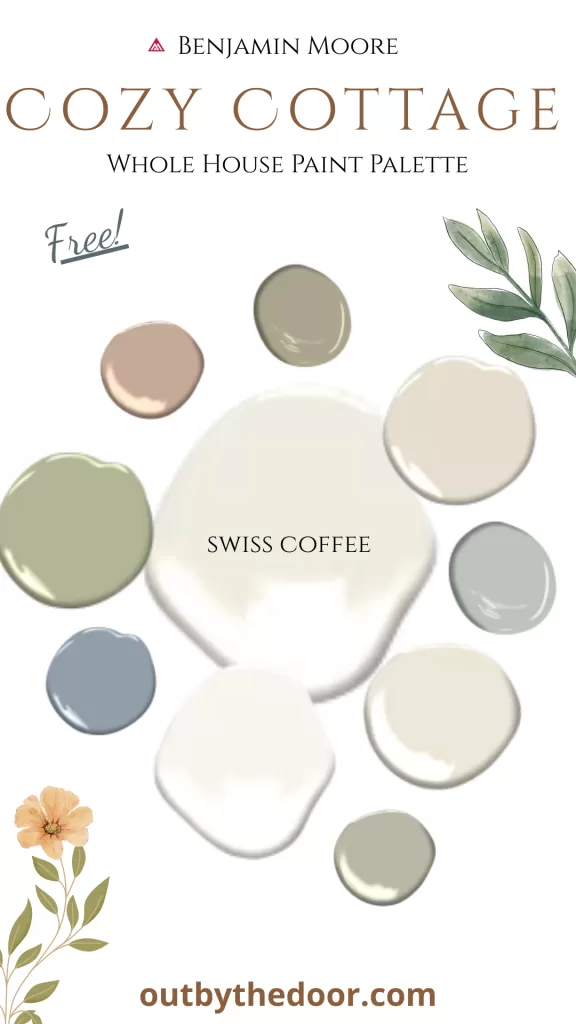
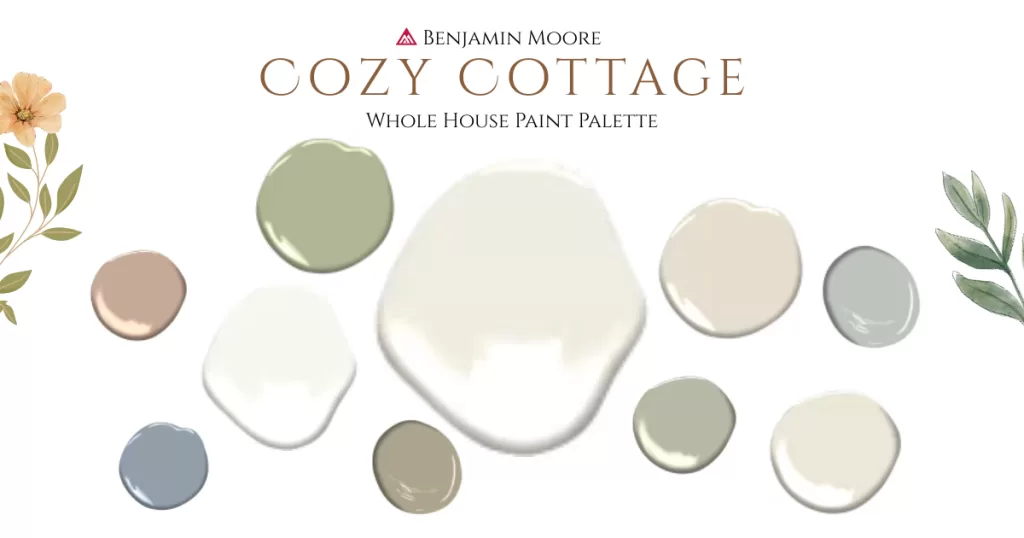
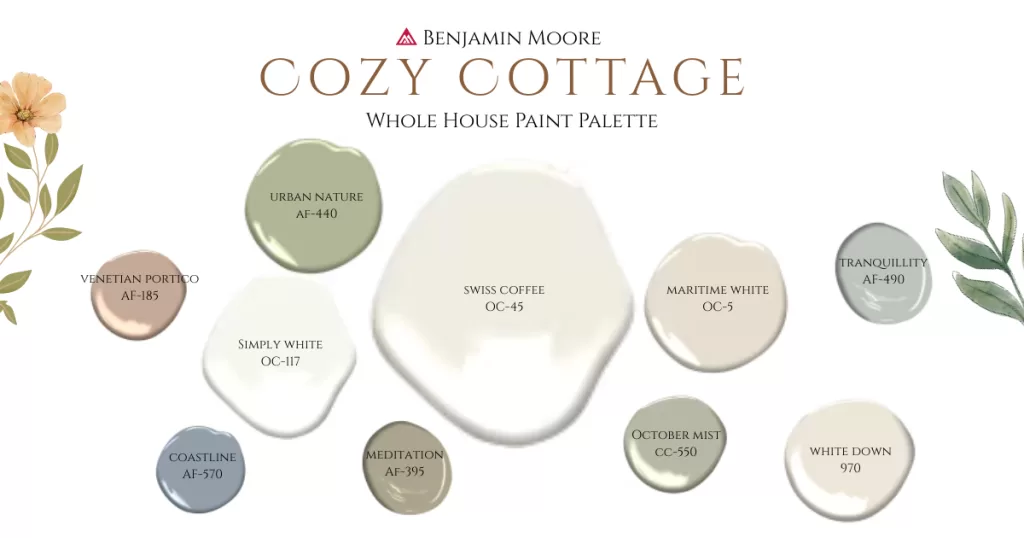
Use my free cozy cottage whole house paint palette with Benjamin Moore colors to transform your house into a warm, welcoming, cozy cottage inspired by nature. With warm whites and beiges, soft greens and blues, hearty neutrals and a touch of vintage, you can give your space that lived-in charm and timeless cottage feel.
Disclosure: as an Amazon Associate, I earn a small commission from qualifying purchases at no extra cost to you. Read my full Disclosure and Policy here.
How paint can transform your space
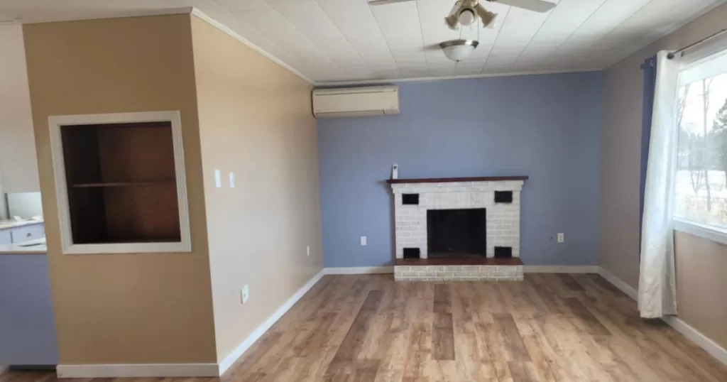
When we first bought our house just over a year ago, it certainly didn’t look like a cozy cottage! It was an outdated and uninviting space that really needed some love. I couldn’t wait to get rid of the glossy brown and bright blue walls.
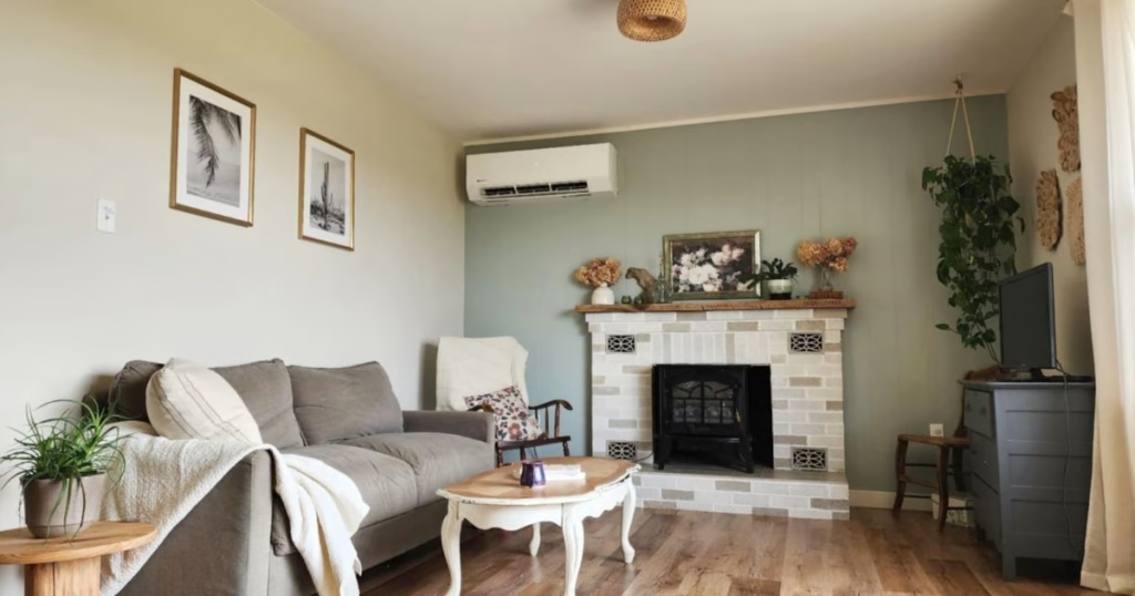
But look how a new coat of paint (with the right colors) completely transformed the space!
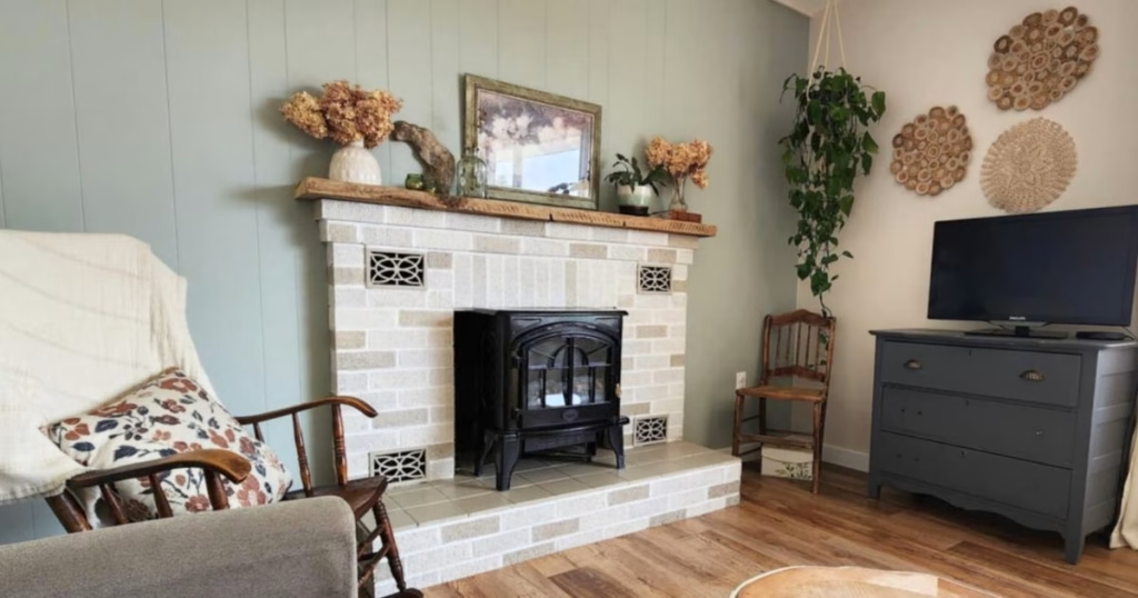
Even the fireplace got a new look with a coat of paint! See my entire DIY low-cost fireplace makeover here!
How to chose the perfect paint palette for your house
When selecting a paint palette for your home, keep a few key things in mind. Even with a pre-made color palette (like this one!), how the colors will look in your space depends on several factors.
Determine how you want your space to feel
Think about the mood you want to create. Calm? Energizing? Cozy? Fresh and clean? This will guide your color choices. Blues and greens are calming and grounding; yellows and oranges feel cheerful and energizing; deep colors create drama and warmth; whites feel bright and fresh.
Each room’s function plays a role too. For example, I wanted our living room to feel calm and relaxing, so I paired neutrals with a soft blue/green. For our dining room, I chose a warm white for a fresh, brighter vibe, perfect for meals, homeschool, and work.
Consider the undertones
Always check the undertones of a color, not just the main hue. This is especially important with neutrals. Undertones are what make a color feel warm vs cool and determine which colors harmonize or clash.
Consider your fixed elements
Pay attention to the fixed elements in your home: floors, tiles, countertops, cabinetry, and major furniture. Since those are staying put, your paint colors need to complement them. For example, warm wooden floors typically pair better with warm-toned paints than cool ones.
Consider the lighting
Lighting dramatically affects how paint looks. Natural light exposure, room orientation (north/south/east/west), and time of day all influence how colors appear: brighter, darker, warmer, or cooler. Always take this into account.
Test, test, test!
The best way to know how a color will behave in your space is to test it! Use small paint samples or peel-and-stick paint swatches. I personally prefer real paint samples because they’re handy for future small projects, but peel-and-stick swatches are mess-free and easy.
Be sure to apply your test colors over a white background (like a primed wall or white poster board) and observe them for several days. Watch how the color shifts with changing light before deciding.
Trust Your Gut (and Your Style)
Lastly, remember that your home should reflect you! Trends come and go, and design rules are meant to be broken sometimes! If you like something, just go for it!
Paint colors in our cozy cottage: Whole house paint palette
Here’s a curated list of all the paint colors I used in our home and how I incorporated them into different rooms. These colors mix and match beautifully for a cohesive, cottage-inspired look.
BM Swiss Coffee (OC-45)
If I could choose only one color for my whole house, it would be Benjamin Moore Swiss Coffee. This warm, creamy white (LRV 81.91) brightens up any space without feeling cold or stark. Its subtle undertones of gray, yellow, and green add depth and warmth.
It pairs perfectly with wood tones, brass, gold finishes, and natural textures, ideal for a cozy cottage!
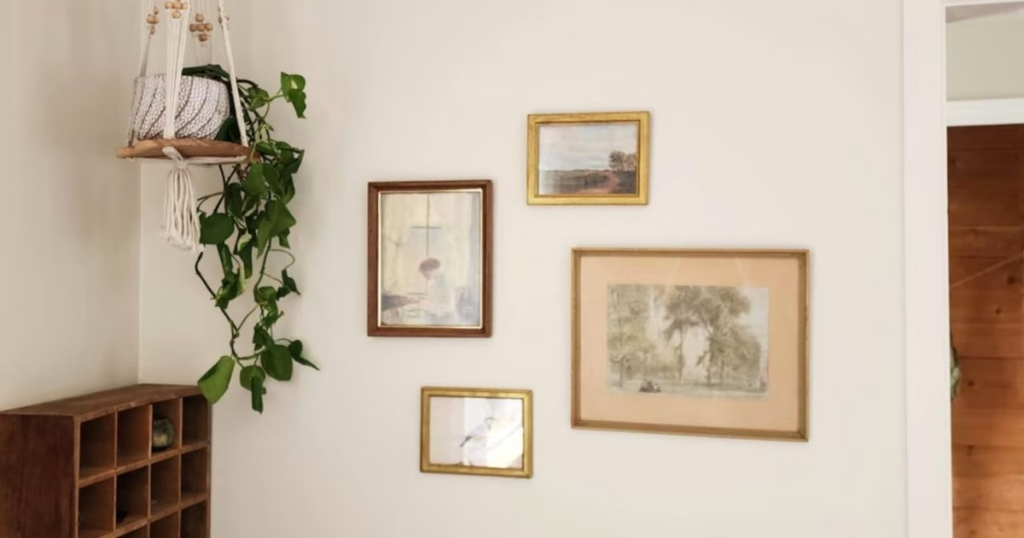
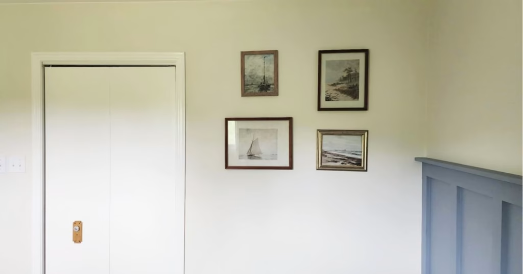
I love how swiss coffee pairs with our beautiful floors and its subtle but elegant contrast with the white trims and ceilings. I think it’s also the perfect neutral canvas to display vintage gallery arts and vintage decor.
I used Swiss Coffee throughout our main living areas: the entryway, dining room, kitchen, and even the bathroom paneling. In rooms with lots of light, it feels fresh and airy; in darker spaces, it feels more warm and cozy.
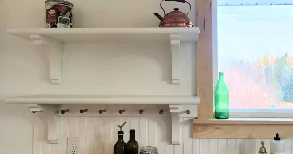
I also used swiss coffee in our kitchen, on the walls, beadboard backsplash, upper kitchen cabinets and shelves. I love the cohesive look it gave our kitchen and it pairs beautifully with the butcher block countertops, the sage green bottom cabinets, and all the brass hardware. You can see our entire cottage kitchen makeover here!
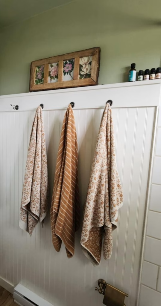
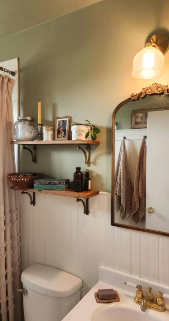
The beadboard paneling in our bathroom is also swiss coffee and I love how it pairs well with the darker, warm green and with the gold and brass accents. In this very small and darker room, swiss coffee looks warmer and darker than in the brighter living area.
BM Simply White (OC-117)
This pretty neutral white with the slightest hint of warmth is the perfect color for trims, doors, and ceilings. With a LRV of 89.52, Benjamin Moore Simply White is a bright, clean white, yet contrasts beautifully with other neutrals and darker whites like Swiss Coffee, highlighting architectural details and brightening up any space. The very subtle yellow undertones lend a gentle warmth that complements cozy, cottage-inspired palettes. With no surprise, Simply White is a very popular and versatile choice for trims, doors, and ceilings.
BM Maritime White (OC-5)
This sophisticated off-white with muted beige tones is one of my favorite beiges! With an LRV of 71.6, Benjamin Moore Maritime White sits in the soft, mid-to-light range. It’s bright enough to keep a room feeling open and fresh, but it has enough depth to add warmth and coziness. Maritime White has both orange (which makes it a beige!) and subtle pink undertones. Don’t worry, it doesn’t look pink on the walls! The undertones just add to its cozy, inviting feel.
This color behaves differently depending on lighting: it looks warmer and lighter in South- and West-facing rooms, and cooler and deeper in North- and East-facing ones. I love how it feels in our West-facing living room and my son’s bedroom, paired with blue-greens and soft neutrals.
Now, be aware that when it comes to Maritime White, your room’s light will make all the difference! In South or West-facing rooms, this beige will look brighter and warmer, with more prominent orange and pink undertones, especially in the evening light.
In North or East-facing rooms, Maritime White will look darker (especially when you don’t have a lot of natural light), with more prominent beige and slightly grey (cool) undertones.
I personally really LOVE how Maritime White looks in my two West-facing rooms. So warm and cozy, yet light and elegant!
I also love Maritime White for a cozy cottage look because it pairs really well with whites, greiges, greens, and blues. Look at how I paired it with a soft blue/green color in my living room, and with a darker shade of green in my son’s bedroom!
BM White Down (970)
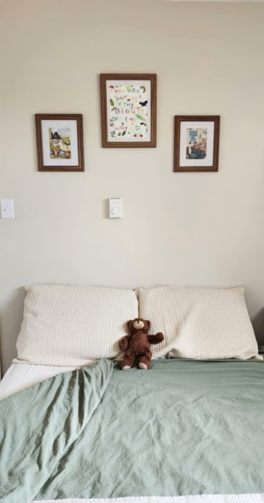
When Maritime White felt too gray and dark in our East-facing bedroom, I switched to Benjamin Moore White Down, a creamy, warm white with yellow undertones. With an LVR of 76.7, Maritime White is a bit brighter than Maritime White, but still offers the perfect amount of depth, especially in spaces with less natural light.
White Down has yellow undertones, which are typically subtle and quite muted. It can however look yellow in certain lights, so always try it in your space first!
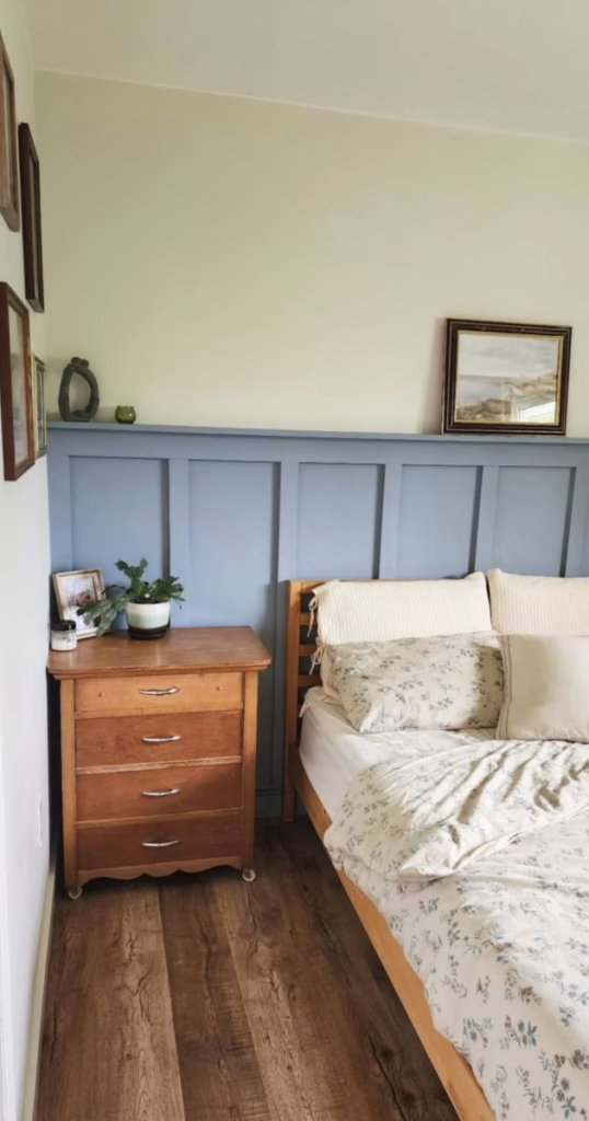
For our master bedroom I was going for a coastal look, so I paired White Down with a blue (BM Coastline) accent wall. I think it turned out beautiful. I also absolutely love how White Down contrasts with our Simply White trims, and how it elevates the look of my small nautical art gallery.
BM Urban Nature (AF-440)
Benjamin Moore Urban Nature is a mid-tone green that feels like a mix between a sage green and an olive green. With an LRV of 44.14, Urban Nature is perfectly balanced between light and dark. It certainly has depth and character, while not feeling too dark even in low-light rooms. Urban Nature is a warm, sophisticated green with brown undertones that make it feel warm, cozy, and grounded. Urban Nature is part of Benjamin Moore Affinity Collection (as many of these colors), a curated collection of colors that all pair beautifully together.
Urban Nature pairs beautifully with hearty tones, warm whites, brass and gold accents, wood, and vintage accents. Great for your cozy cottage feel!
I chose Urban Nature for our small bathroom’s walls, including the ceilings, and I LOVE how it transformed this small space into a cozy space full of warmth and character! Here, it’s paired with Swiss Coffee paneling, dark wood, and gold/brass accents.
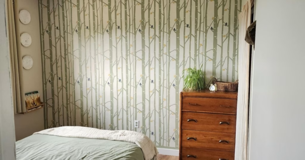
I also used Urban Nature in my son’s stencil accent wall, paired with Maritime White, and some yellow and blue little accents.
BM October Mist (CC-550)
Benjamin Moore October Mist (color of the year 2022) is a muted silvery sage green with subtle warm undertones. With an LRV of 46.54, it sits mid-tone, similarly to Urban Nature, but has more gray and less warmth, making it a gentler, more neutral green. I used October Mist in our small cottage kitchen for our bottom cabinets, pairing it with Swiss Coffee for the tops, backsplash, and walls. You can see our entire cottage kitchen makeover here!

In our bright small kitchen with two windows facing south and east, this green color certainly shifts during the day, looking lighter and more “washed out” at midday, and warmer and deeper in the evenings.
October Mist truly behaves like a neutral, pairing beautifully with other earthy tones, warm whites, warm metal and wooden accents, and natural elements.
BM Tranquillity (AF-490)
Benjamin Moore Tranquillity is a soothing sage color with both gray and blue tones. With an LRV of 53.31, Tranquillity is a pale mid-tone color that can work well in different lightings. Tranquillity really leaves up to its name, immediately grounding a space with a sense of calm and peace.
Tranquillity is also a color that will vary A LOT depending on your light. In South and West-facing rooms it will look warmer and more like a sage green, whereas in North- and East-facing rooms it will look more blue and gray. This is another color you MUST try in your space before committing to it.
I used Tranquillity in our living room fireplace accent wall. Here, it paired really well with Maritime White on the other walls, and with all the natural, hearty colors in our fireplace. It really helped creating that relaxing, grounding feeling I was going for.
BM Meditation (AF-395)
Benjamin Moore Meditation is a brown with some gray and green tones. Its LVR of 36.48 makes it one the darkest color in this palette. This color works beautifully as an accent color on small accent walls, doors, or even painted furniture. It pairs great with all the neutrals in this color palette.
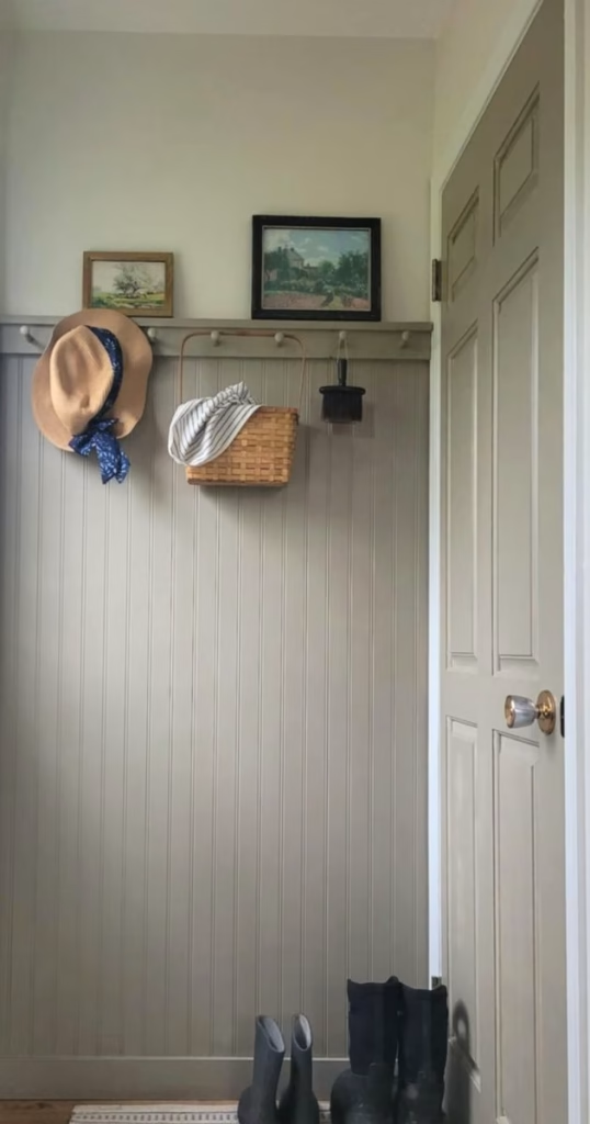
I used Meditation in our porch beadboard accent wall, as well as on the adjacent door. I love how it paired with Swiss Coffee on the walls and how it brings out the character of my vintage decor. I also chose this darker brown-ish color for this area out of practicality, as life gets messy (and muddy) here!
BM Coastline (AF-570)
Benjamin Moore Coastline is a dusty blue with gray and subtle green undertones. Its LRV of 33.93 makes it actually the darkest color in this palette, as well as the coolest one.
Now, let me tell you that picking blue paint colors seems like the hardest task of all! For our costal cottage themed master bedroom, I was looking for a blue that looked vintage, not too dark, but not too light, and that paired well with our White Down walls. Our bedroom faces East and doesn’t have tons of natural light, and every blue I tried looked gray and “bluh”. I finally decided to ask my local Benjamin Moore retailer for advice and he pointed to Coastline. After trying it at first, I thought it would be way too dark, but, tired of trying blue colors, I decided to give it a try. I ended up really liking our blue accent wall, and I think it pairs really well with the creamy-yellow walls in White Down.
BM Venetian Portico (AF-185)
The final color in this cozy cottage palette is Benjamin Moore Venetian Portico, a hearty clay color with dusty pink tones. With a LRV of 41.94, this color sits in the mid-tones.
Venetian Portico complements beautifully all the neutrals and greens in this palette, adding a touch of interest and femininity. This color works perfectly in East-facing rooms because of its warmth and depth. Even though I haven’t used it in our house yet, I’m planning to add a board and batten accent wall to our living room. I think it’s going to look great with the Swiss Coffee walls and with the adjacent October Mist kitchen cabinets.
Tips for painting your house like a pro
Painting your house yourself is one of the most budget-friendly ways to transform your space. Choosing the right colors is just the beginning: applying them well is equally important. Here are my best tips from painting nearly every inch of our 950 sq ft home:
Choose a good paint
I swear by Benjamin Moore Ben, the most affordable BM line. It’s easy to apply, low-VOC (minimal odor), and offers beautiful results. I use eggshell for walls and semi-gloss for trims/paneling.
Prep, prep, prep!
Good prep work makes all the difference. For minor imperfections: spackle, sand (fine-grit), clean, and tape.
For major issues (glossy/dark walls or lots of damage): spackle or mud, sand (medium then fine-grit), clean, prime, sand again, and then paint.
Choose the right tools
You don’t need many or super fancy tools to paint well, but these are my essentials that make the job easier.
- Good primer and paint (see above)
- Good roller with extension pole and roller brush for large areas
- Good angled brush for corners and small details
- Edger for neat edges around ceilings and trims
- Tape for sharp edges and protecting floors
- Wall sander for sanding walls and sanding pads for small details
- Drywall spackling for patching holes and imperfections
Be patient
Painting takes time, especially if you’re juggling kids or a busy schedule. Take time to prep, apply coats evenly, and let them dry. The effort pays off with a beautiful finish you’ll love!
I hope these timeless paint colors I used in our house inspire you! Are you in the process of picking paint colors for your home? Do you prefer a neutral uniform look or do you also like to add a splash of color here and there? Drop me a comment down below and let me know your thoughts!
Shop this post
ScotchBlue PROSharp Painter’s Tape
Wooster Brush Roller Cover 3/8-Inch Nap, 9-Inch (set of 3)
Wooster Shortcut Angle Sash Paintbrush
Shop all my favorite kitchen essentials, home decor, DIY tools, and more here!
Related posts
Low-Cost DIY Fireplace Makeover: Painting Old Brick into Faux Stone
Small Cottage Kitchen Makeover on a Budget
Cute and Cozy Minimalist Kid’s Bedroom on a Budget
Pin it for later